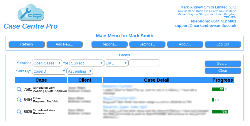
In our never ending quest to improve our software, we have today successfully rolled out a new version of Case Centre Pro with a new updates, new features, and improved searching.
New look
If you are using an Apple Mac, then the software will automatically adjust it’s style to look like Mac buttons, Mac input boxes, and Mac drop down selects. If you are using a Microsoft Windows computer, again, it will style itself to be familiar to the user. This is so that the user feels at home as if the software is installed locally on their computer, when in reality, it is all in the cloud.
Moving the case view magnifying glass
In the last version, we moved the action of the magnifying glass that you click on to go into the case detail over to the right hand side. Following complaints that this was harder to see which case to select on those larger (or wider) monitors, we have taken on board user comments, and moved it back to the left again. We listen. We care.
Making the case progress stand out
With all the blue on the screen, the case progress just didn’t stand out, so by changing it to green has helped everyone.
Better searching
Why should the user have to define exactly what they want in “computer speak” to get the search to work? Why can the system just anticipate what the user is searching for, ie, if the search is all numeric, is it a case number the user entered? Well yes, again we have listened to comments, taken all of those on board and updated and simplyfied the search. It is now far far simpler to use.
New case reference field
In this new version, you can enter your own reference to a case, or a reference to a piece of equipment. For example, the number plate of a vehicle that came in for repairs or service. Searching on that vehicle for it’s history is simply a case of searching in “closed cases” for that vehicle registration number using the new search facility above.
All users of Case Centre Pro now have our new version, and we hope that you enjoy the new feature set and improvements to the old features.
